In 2012, the filmmaker Errol Morris ran an experiment in the New York Times. He published a short passage about the likelihood of a large asteroid striking Earth and asked readers a simple question: do you believe this statement is true?
Forty thousand people responded. What they didn’t know was that Morris was randomly assigning them different typefaces. The same passage, the same words, the same argument. Some readers saw it in Baskerville. Some in Helvetica. Some in Comic Sans. Some in Georgia, Trebuchet, or Computer Modern.
The readers who saw Baskerville were measurably more likely to agree with the statement. The effect was small in percentage terms but statistically significant across a sample of forty thousand people. Same sentence, different font, different level of belief.
What this actually means #
Morris wasn’t a typographer. He was a documentary filmmaker who spent his career thinking about how presentation affects perception. He designed the experiment with the psychologist David Dunning (of Dunning-Kruger), and they published the results under a title that should have made every designer and marketer stop what they were doing: “Hear, All Ye People; Hearken, O Earth.”
The finding itself was narrow. Baskerville, a serif typeface designed in 1757, carried more perceived authority than sans-serif alternatives or fonts with casual connotations. That’s interesting but predictable. What made the experiment significant was what it demonstrated at the structural level: the container was doing persuasive work that had nothing to do with the content.
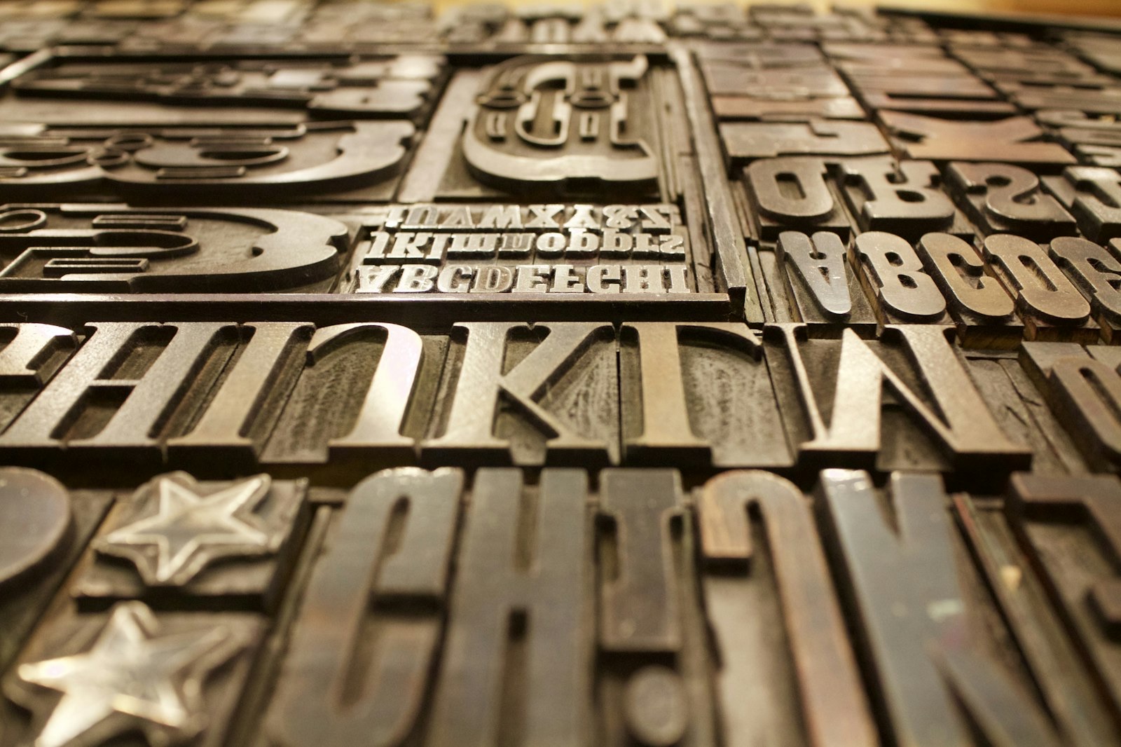
This is something typographers had known intuitively for centuries. John Baskerville himself was obsessed with the relationship between letterform and readability. He designed his own paper, his own ink, and his own press to ensure his typefaces performed the way he intended. He understood that reading is a physical act and that the shapes on the page participate in meaning.
But understanding something intuitively and measuring it are two different things. For most of the history of printed communication, typeface selection was considered a design decision. Aesthetic. Downstream. Something the art department handled after the real work of writing was done.
The gap #
The gap between “typeface is decoration” and “typeface is a variable that affects whether people believe what they’re reading” is enormous if you think about what sits inside it.
Every newspaper, every advertisement, every legal document, every political campaign, every product label, every piece of packaging on every shelf in every store. All of them were typeset. All of them were making an argument that included the letterform whether anyone intended it or not. For decades, centuries really, the people making those decisions either knew this and couldn’t prove it or didn’t know it at all and chose fonts based on taste, convention, or whatever was loaded on the machine.
Morris gave them the proof. And the proof was uncomfortable for the same reason Semmelweis made doctors uncomfortable, even though the stakes were incomparably lower. It meant that something people had been treating as a secondary decision was doing primary work. Every “it doesn’t matter, just pick one” conversation about a font had been wrong.
Where it landed #
Typography is now a recognized variable in UX research, marketing science, and interface design. A/B testing font choices in email subject lines, landing pages, and ad copy is routine. Luxury brands spec their typefaces the way they spec materials. Tech companies employ dedicated typographic teams. Google commissioned an entire typeface family (Noto) designed to render correctly in every writing system on earth, because they understood that the shape of the letters was part of the product.
None of this is controversial anymore. The idea that font choice affects perception is so widely accepted that saying it out loud sounds like stating the obvious.
That’s exactly the point. It is obvious now. It was not obvious in 2011.
The distance between those two years is one experiment, one viral article, and a few hundred conference talks. The underlying reality didn’t change. Letters were always doing this work. The only thing that changed was that someone measured it and the measurement was clean enough that people couldn’t look away.
The recurring shape #
This is the same pattern from the first post in this series, running at a much lower temperature. Nobody died. Nobody went to an asylum. But the structure is identical: something treated as background turns out to be doing real work when someone finally points a measurement instrument at it. The people closest to the existing way of doing things are the slowest to accept it. And once the transition happens, the previous era becomes hard to understand.
The question that sits underneath both of these stories is the same one. What else is doing this work right now, in plain view, that nobody is measuring?